Client
Kopagari
Industry
Fintech
Country
Tanzania
Role
Product designer (solo)
Platform
Mobile and web
Making vehicle financing possible
Designing a vehicle financing platform that tells Tanzanian users what they can afford before they walk into a dealership.

The Problem
In Tanzania, access to vehicle financing is slow, opaque, and frequently ends in rejection. The traditional process requires lengthy applications, document submission, and weeks of waiting, only to discover at the end that the applicant does not qualify or cannot meet the deposit requirement. Many people never apply at all, not because they cannot afford financing, but because they have no way of knowing whether they can before they try.
Kopagari addresses this at the front of the process. It is a spin-off of Mtaa wa Manka, Black Swan's broader loan marketplace, purpose-built for vehicle financing and designed for name recognition — Kopagari loosely translates to "finance a car" in Swahili. Rather than asking users to commit before they know whether they qualify, it gives them two tools upfront: a free affordability calculator that tells them what they can borrow based on their income and expenses, and a formal prequalification flow for users who are ready to take the next step with a lender.
The design challenge was not the flow. It was trust. Users are being asked to upload sensitive financial data to a platform they have never used before, in a category where they have either experienced rejection before or are hesitant to try at all for fear of what they might find out. Every design decision had to answer one question: does this feel safe enough to continue?
Role and constraints
I owned the full design process end-to-end: information architecture, user flows, wireframing, visual design, and Figma implementation. I worked directly with the founding CEO, whose vision shaped the product, and alongside the engineering and data teams from the start.
Scope
End-to-end product design
The most binding constraint was the nature of the product itself. Kopagari operates under hard financing rules: maximum financing at 60% of vehicle value, minimum deposit of 40%, maximum loan amount of TZS 100,000,000, and a maximum term of 24 months. These figures could not be softened or approximated in the UI. A platform asking users to trust it with their financial data had to be precise and honest about what it was offering in return.
Key assumptions
Kopagari was a greenfield product. There were no active users or analytics to draw from. Product decisions were shaped by the founding CEO's vision, the lender's financing terms, and the design foundation established through Mtaa wa Manka.
Several assumptions guided the design:
Users needed to know their affordability range before committing to the process, not after.
The deposit figure had to be shown in shillings, not percentages, to give users a concrete decision point.
Car dealers and brokers were not the enemy. They were a distribution channel and needed to feel included in the platform rather than edged out.
A soft, advisory tone on low-qualification outcomes would keep the door open rather than closing it.
The two front doors
The platform has two distinct entry points that had to feel different from the very first screen.
Calculator
Loan affordability calculator
FREE
No documents. No commitment. Takes income, expenses, employment type, and preferred repayment period. Outputs an indicative loan band, required deposit in TZS, and estimated monthly repayment. Designed for users who are curious or still deciding. The calculator was a new addition specific to Kopagari, introduced to lower the barrier to entry for users who were not yet ready to prequalify.
Prequalification
Loan affordability calculator
PAID
Requires documents and a bank or mobile money statement. Higher commitment. Outputs a lender-ready certificate valid for 30 days, with a unique reference number and QR code for verification. Designed for users who are ready to engage a lender.
The calculator produces an estimate. Prequalification produces a certificate. The design never treats these as the same thing. Separate entry points, separate language, and colour differentiation between the active prequalification card and the post-application card reinforce the distinction at every stage.
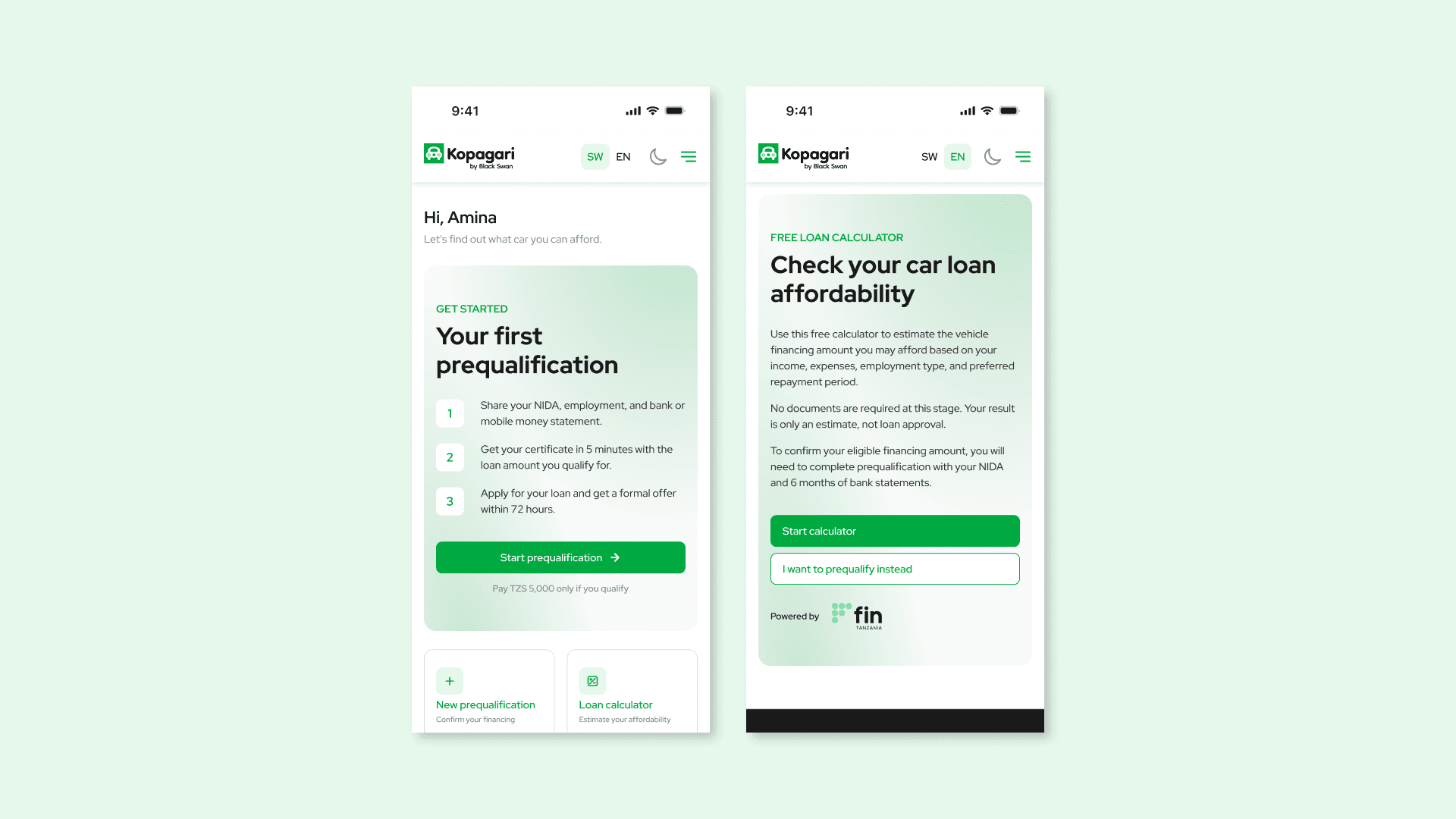
Two entry points, two different commitments. The prequalification dashboard prompts users to start a formal process with a certificate at the end. The calculator card offers a free, no-documents estimate for users who are still deciding. Same platform, clearly different paths.
Four decisions that mattered
DECISION 1
Rejection language that keeps the door open
When a user's financials indicated lower chances of pre-approval, the platform did not tell them no. Two bottom sheets handled this: an Advisory Assessment, which appeared mid-flow and offered the user a choice to adjust their loan details or continue as is, and a Pre-approval Assessment, which appeared after statement analysis and gave the user the option to upload a stronger statement or proceed regardless. The framing throughout was advisory, not terminal. A result would still be shared within 48 hours regardless of what the assessment indicated.
TRADE-OFF
Letting users proceed when their chances are lower creates the possibility of a disappointing outcome from the lender. That outcome was considered preferable to a platform that closes doors before users have had a fair chance.
DECISION 3
Including agents and brokers, not excluding them
Car dealers and brokers are typically the first point of contact for anyone considering a vehicle purchase in Tanzania. Rather than designing around them, the platform gave agents a referral mechanism on the prequalification flow, linking each prequalification to a referring agent for future incentivisation. This turned potential friction into a distribution channel.
TRADE-OFF
Building agent referral logic into the flow added complexity to the prequalification process. The long-term distribution benefit outweighed the short-term design overhead.
DECISION 4
Statement upload error states that protect user trust
The statement upload step is the highest-anxiety moment in the prequalification flow. Several error states required careful handling. A password-protected PDF triggered an overlay that explicitly told users not to enter their banking password, only the PDF document password, to prevent confusion and alarm. Name mismatches between the statement and the application details triggered a separate overlay flagging the discrepancy. Invalid or outdated statements had their own distinct states. Each error was specific, actionable, and non-accusatory. Session timeout was also handled through an overlay giving users the option to stay logged in or exit cleanly.
TRADE-OFF
Designing explicit states for every error condition required significantly more screens than a generic error handler would have. For a platform handling financial data, that specificity was not optional.
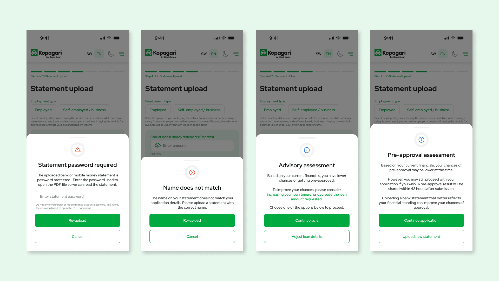
Every overlay that could make or break trust at the statement upload step. Password protection, name mismatch, and two advisory states that keep the door open rather than closing it.
Final Screens
CALCULATOR PATH
Explains what the calculator does and does not do. Sets expectation that output is an estimate, not approval.
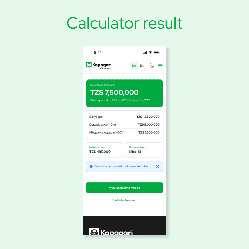
Estimated loan band, required deposit in TZS, estimated monthly repayment. Primary CTA: Start prequalification.
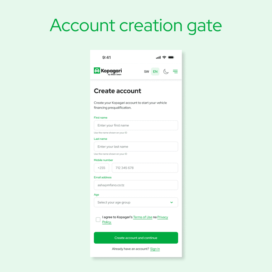
Name, phone, email, age range required before result is shown. The estimate is the reward for registering.
PAYMENT
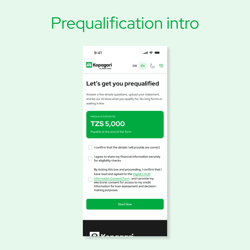
Seven steps listed. TZS 5,000 fee introduced with the conditional rule explained immediately: you only pay if you qualify.
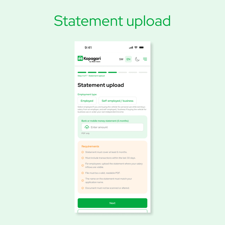
Step 4: bank or mobile money statement. Validation errors handled inline -- invalid file, name mismatch, password-protected.
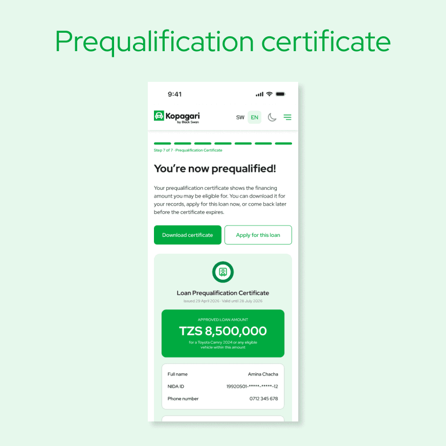
Formal certificate showing qualifying loan amount, terms, and validity period. Downloadable as PDF.
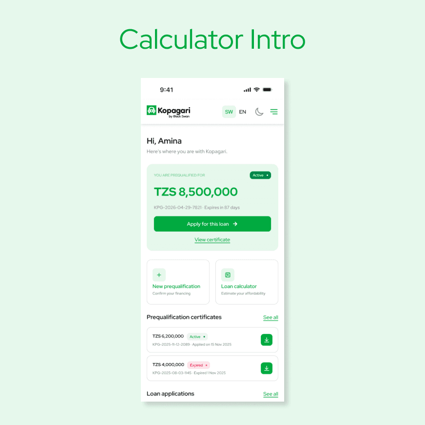
DASHBOARD
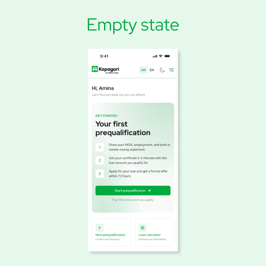
Hero card prompting first prequalification. Three-step preview and conditional-fee reassurance line visible.
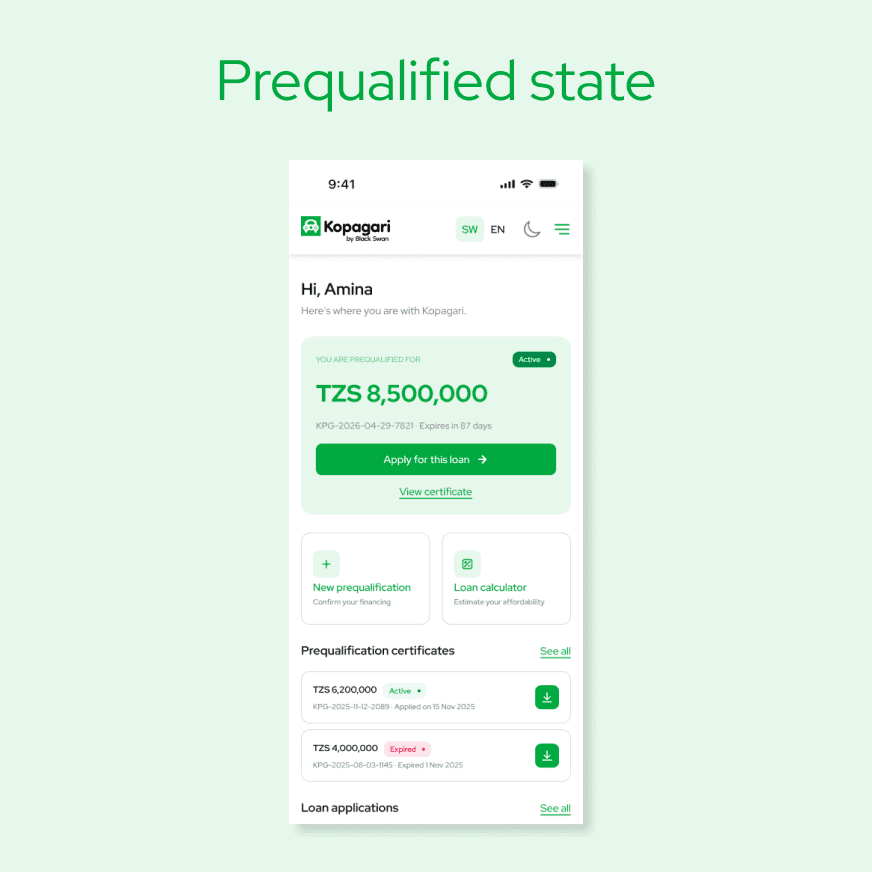
Active certificate card with qualifying amount, expiry, and "Apply for this loan" primary CTA.
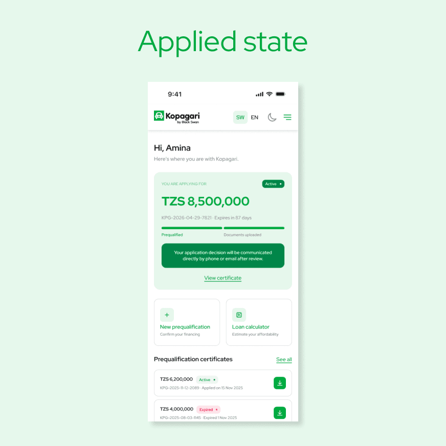
Application in review. 72-hour decision promise. Submitted documents checklist visible.
Outcome
Kopagari was delivered to Black Swan for build and deployment. The platform was designed to support both direct users and agent-referred users through a single coherent flow, with the prequalification certificate built to function as a verifiable, lender-ready document from day one. The advisory language approach to low-qualification outcomes was carried through every relevant state in the final Figma handoff.
What I learned
Designing for financial access means designing for anxiety first. The users most likely to benefit from Kopagari are the ones most likely to abandon it at the first sign of friction or unfamiliar language. Every bottom sheet, every error message, and every label was an opportunity to either reduce that anxiety or compound it.
The distinction between the calculator, the prequalification, and the loan application seems obvious in a brief. In a live product with overlapping language and similar visual patterns, it requires constant discipline. Naming, colour, entry point separation, and copy tone all had to work together to keep those three things distinct in the user's mind throughout a process that could span multiple sessions.

