Client
Inspire STEM Hub
Industry
Edtech
Country
Tanzania
Role
Product designer (solo)
Platform
Responsive web, offline-first
Teaching code to kids who have never seen a computer lab
Designing a STEM learning platform for two very different audiences: an 8-year-old building their first LED circuit and a teenager writing Arduino code, inside a single coherent product.

The Challenge
In Tanzania, hands-on STEM education is expensive and unevenly distributed. Inspire STEM Hub's answer was an Arduino-powered kit paired with a digital platform that could guide students through real coding and electronics projects, with or without a teacher, and with or without a reliable connection.
The platform had to serve a Primary student aged 8 using block-based coding and a Secondary student aged 16 writing Arduino-style code, on the same platform, with the same design system, without either experience feeling like a compromise.
That gap between two users is not a detail. It is the central design problem.
Role and constraints
I led the product design end-to-end: information architecture, user flows, design system, and high-fidelity UI. I worked directly with the client lead, who owned the brief and provided the full curriculum scope, benchmark references, and an early concept site that captured the product vision. Throughout the build, I worked closely with the front and back end developers, checking technical feasibility continuously so that design decisions were grounded in what could actually be built.
Scope
End-to-end product design
Because the platform was designed before launch, there were no active users or analytics to draw from. Product decisions were informed by the client's curriculum materials, competitor benchmarking across comparable STEM learning platforms, and ongoing feasibility checks with the development team. The design process was fundamentally about making sound decisions under uncertainty, not synthesising large volumes of user research.
The two audiences
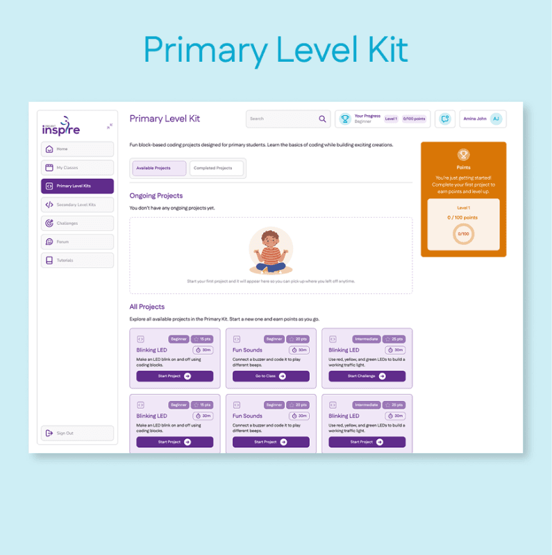
Primary
Ages 8 to 12
Block-based drag-and-drop coding
Projects like blinking LEDs and basic sounds. Needs immediate visual reward, short feedback loops, and zero assumption of prior knowledge.
Secondary
Ages 13 to 18
Text-based Arduino IDE-style coding
Projects like motion-activated lights and smart water monitors. Needs a code editor, circuit setup guides, and a challenge progression system.
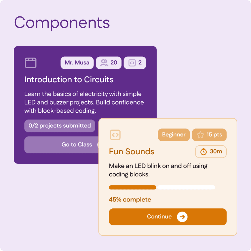
Both audiences share the same navigation shell, design system, and gamification layer. Content, interaction model, and visual density are calibrated separately per level. A Primary project card uses large type, warm colours, and a single Start action. A Secondary card shows difficulty badges, point values, estimated time, and a circuit table. Same component, different configuration.
Four distinct user types designed for simultaneously: Primary student, Secondary student, Teacher, and self-guided learner without a class.
Key assumptions
Designing a greenfield product meant assumptions had to carry the weight that research would in a later-stage product:
Younger learners need visual programming, short steps, and immediate feedback from the kit.
Teachers need classroom-level visibility without monitoring students individually.
Internet connectivity cannot be assumed in many classroom environments.
Students must be able to progress even when a teacher is unavailable.
These assumptions became the design principles the product was built against.
Audience architecture
The first structural decision was how to handle two fundamentally different learner types within one product.
Rejected
Separate apps per level
Clean separation, but doubles maintenance cost, breaks shared progress tracking, and creates a disjointed experience for students moving between levels.
Rejected
Single UI, no calibration
Simpler to build, but forces an uncomfortable middle ground; too complex for an 8-year-old, too simplified for a 16-year-old.
Chosen
One system, calibrated per level
Shared design system, navigation shell, and gamification layer, with per-level content configuration. One codebase, two experiences.
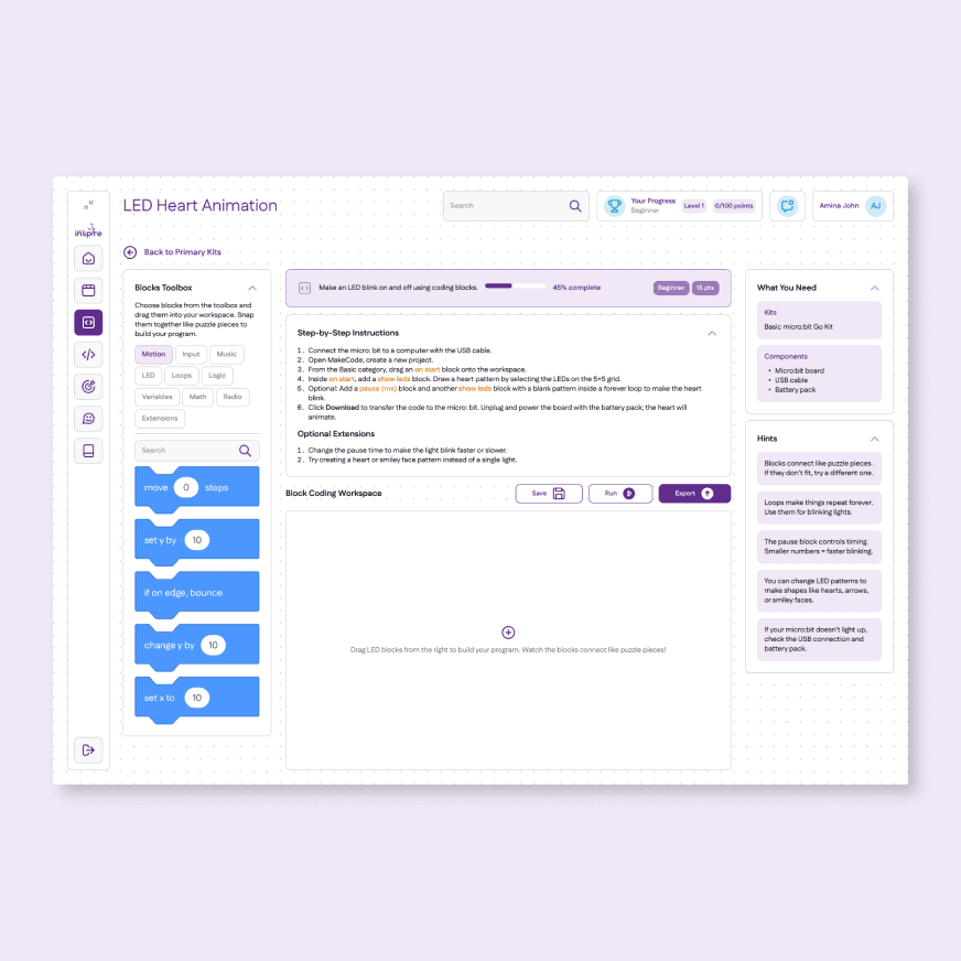
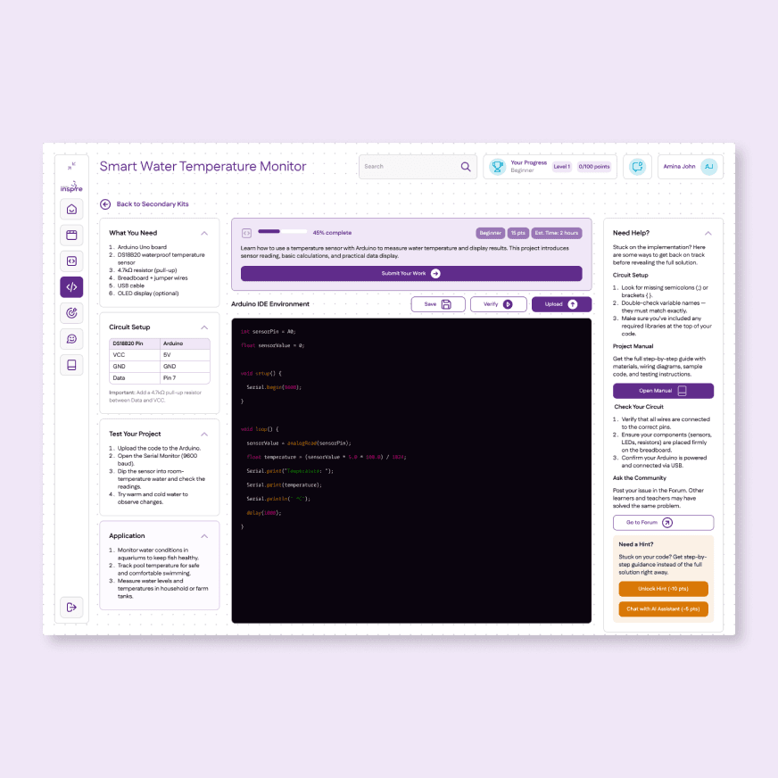
Same layout, two different learners. Block-based drag-and-drop for Primary, Arduino IDE-style code editor for Secondary. Same navigation shell, entirely different interaction model.
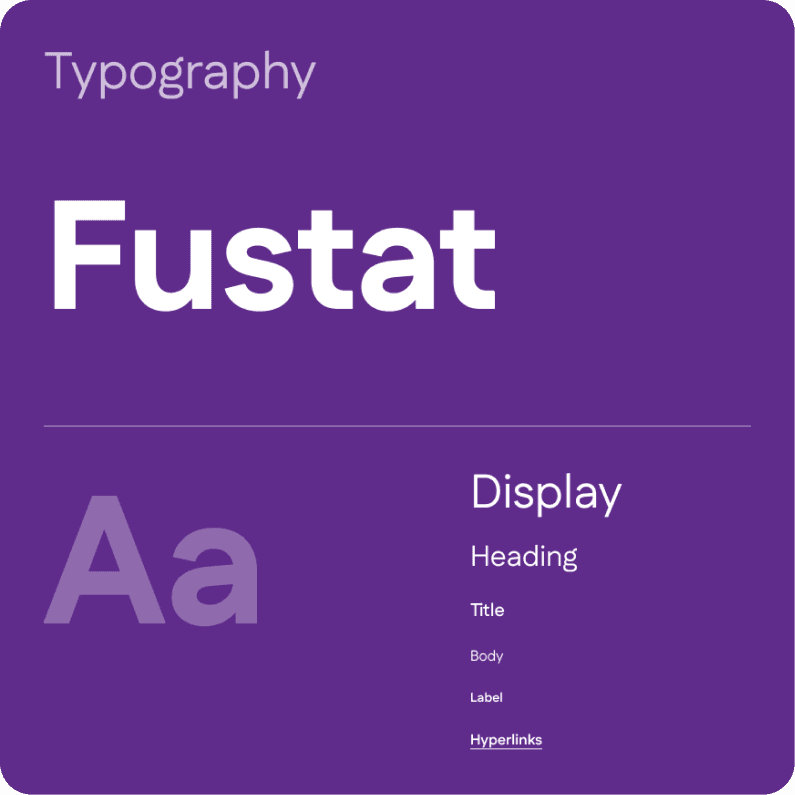
Visual language
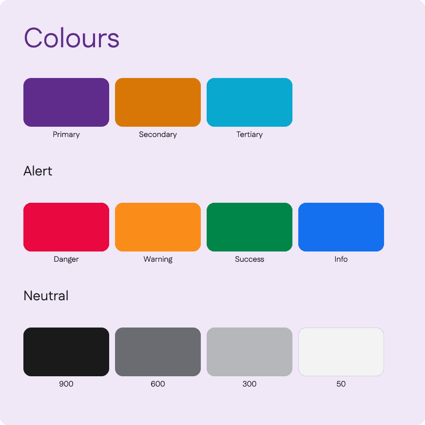
The design system was built from scratch using the client's existing brand colours as the foundation. Amber was introduced as a deliberate addition: neutral colours would not create the visual stimulation that younger learners need, and warm, high-energy colour helps sustain attention and signal reward at the Primary level. The Secondary experience uses the same system with a cooler tonal shift, reflecting the more focused, technical nature of that audience's work.
Every component, from project cards to progress rings, had to serve both a child and a teenager without requiring a separate version for each.
Three decisions that mattered
DECISION 2
Offline-first with optimistic local saves
Project state is saved locally first and synced when a connection is available. From the student's perspective the save is silent and instantaneous. Sync status is visible but passive, tucked into the header rather than blocking the workspace.
TRADE-OFF
Optimistic saves create edge cases where two devices hold conflicting versions of the same student's work. A last-write-wins strategy was chosen for simplicity, acceptable because students work on one device at a time in a classroom context.
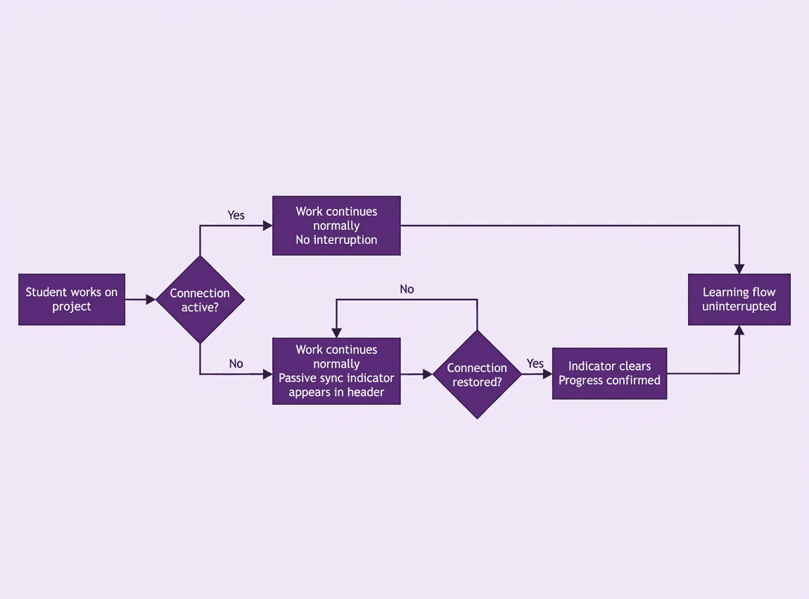
The offline-first experience from the student's perspective. Regardless of connection state, work never stops. A passive sync indicator appears in the header when offline and clears silently once progress is confirmed — no interruption to the learning flow.
DECISION 3
AI hints bounded by kit content
The platform includes an AI-powered hint system for when students get stuck. Hints are limited strictly to the current project's kit content. A student asking how to connect a sensor gets a response grounded in the specific project manual, not a generic answer from the web. The client operates in the edtech space and the curriculum materials provided were professionally developed, so the learning design logic that shaped this decision came from that foundation. The goal was to help students understand concepts without bypassing the lesson.
TRADE-OFF
The AI is less capable than an unbounded assistant. Students who need help beyond the kit scope go to the teacher or the community forum. That friction is intentional; the platform is a structured learning environment, not a general-purpose coding tool.
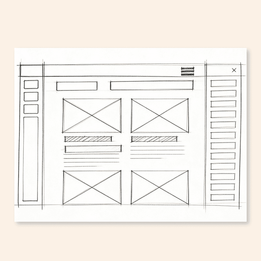
The wireframe established the core layout: persistent left navigation, global header with progress tracking, content grid, and gamification panel. The final screen realised that structure with the full visual system applied.
Final Screens
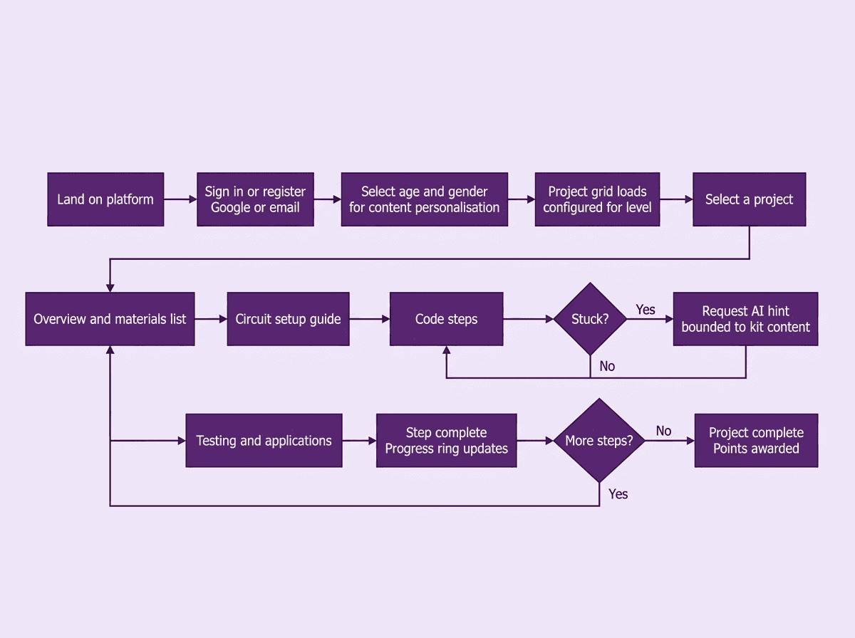
How a student moves through the platform, from first login to completing a project. The flow covers authentication, content personalisation, and the full project experience including the AI hint system and progress tracking.
ONBOARDING AND AUTHENTICATION
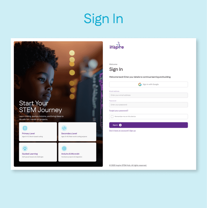
Split-panel layout with editorial image left, clean sign-in form right. Google and email options.
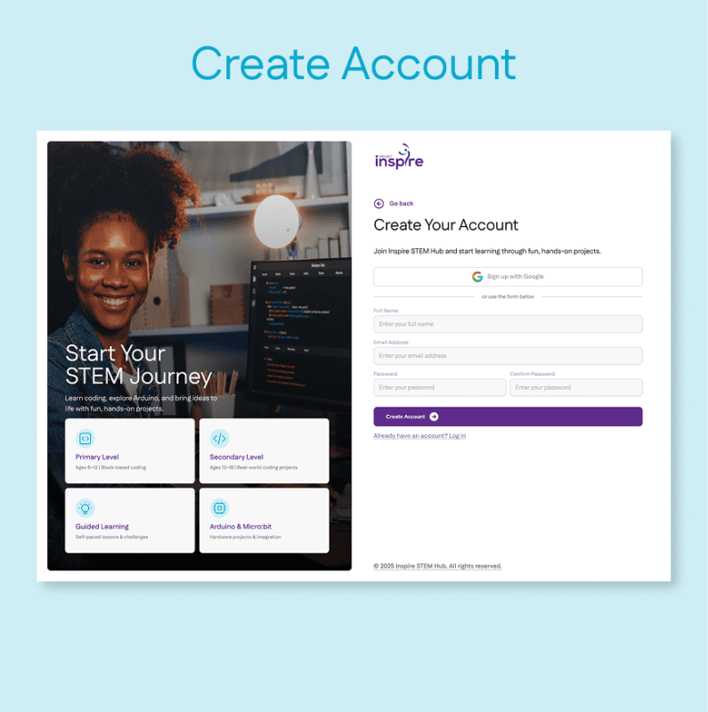
Registration form with inline password validation and Google sign-up option.
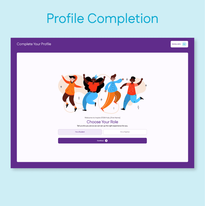
Age and gender selection for content personalisation. Success modal on completion.
STUDENT EXPERIENCE
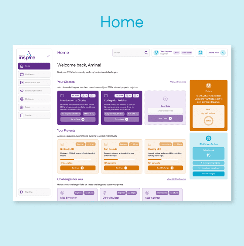
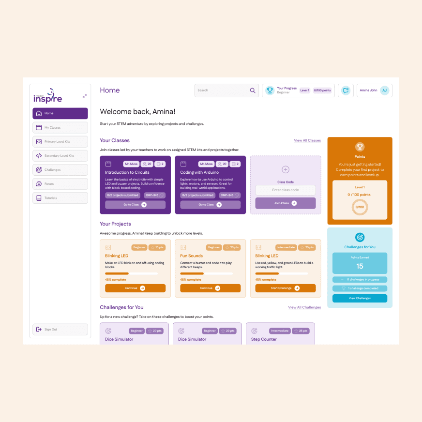
Project grid with an ongoing project card, amber gamification panel, and beginner badges.
Project grid with difficulty badges, points, amber gamification panel, and estimated time per project.
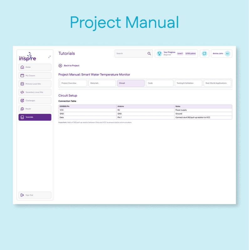
Tabbed step-by-step guide covering overview, materials, circuit, code, testing, and applications.
COMMUNITY AND CHALLENGES
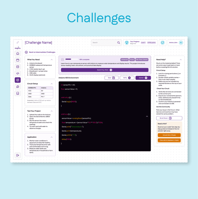
Secondary-level project workspace with Arduino IDE code editor, circuit setup table, materials list, and a contextual AI hint panel on the right.
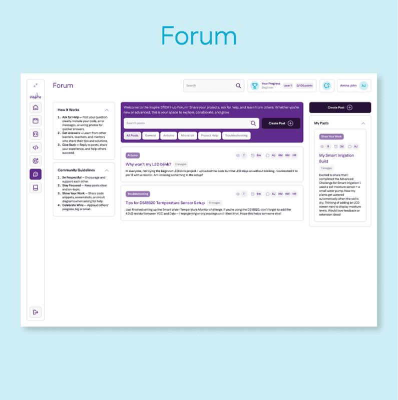
Community discussion with post creation modal, image attachment, and category tagging.
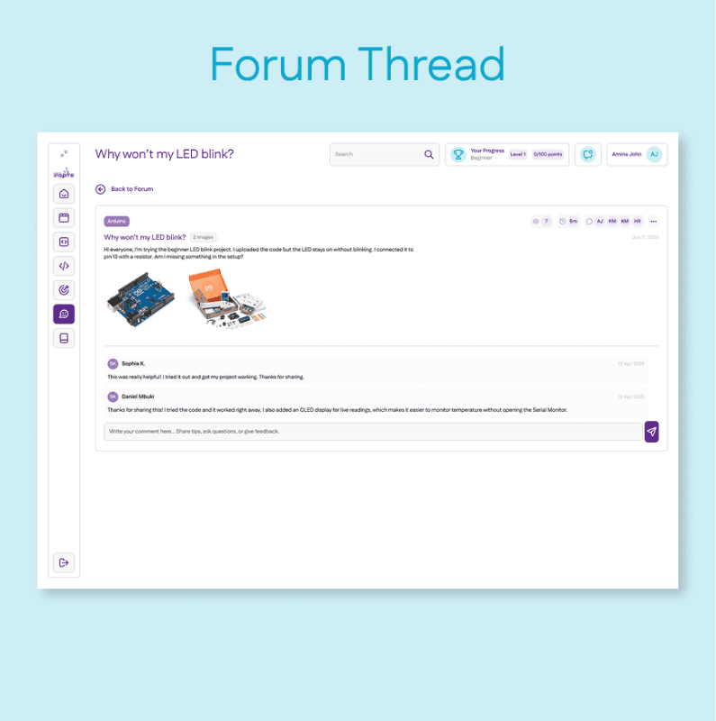
Individual post view with Arduino hardware photos, comments, and reply input.
TEACHER DASHBOARD
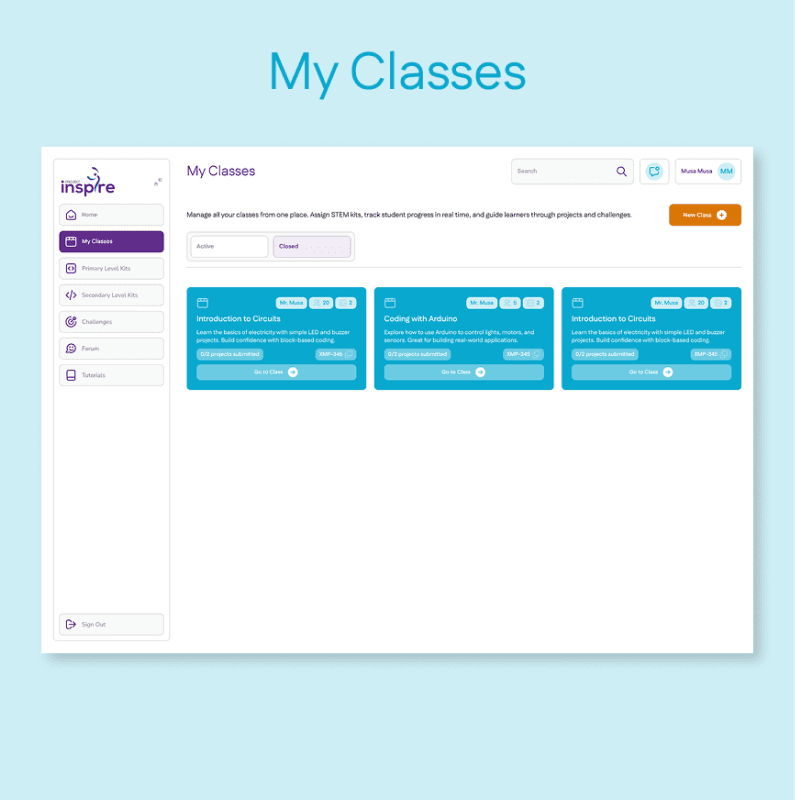
Class cards with student count, project count, class code, and "Go to Class" action.
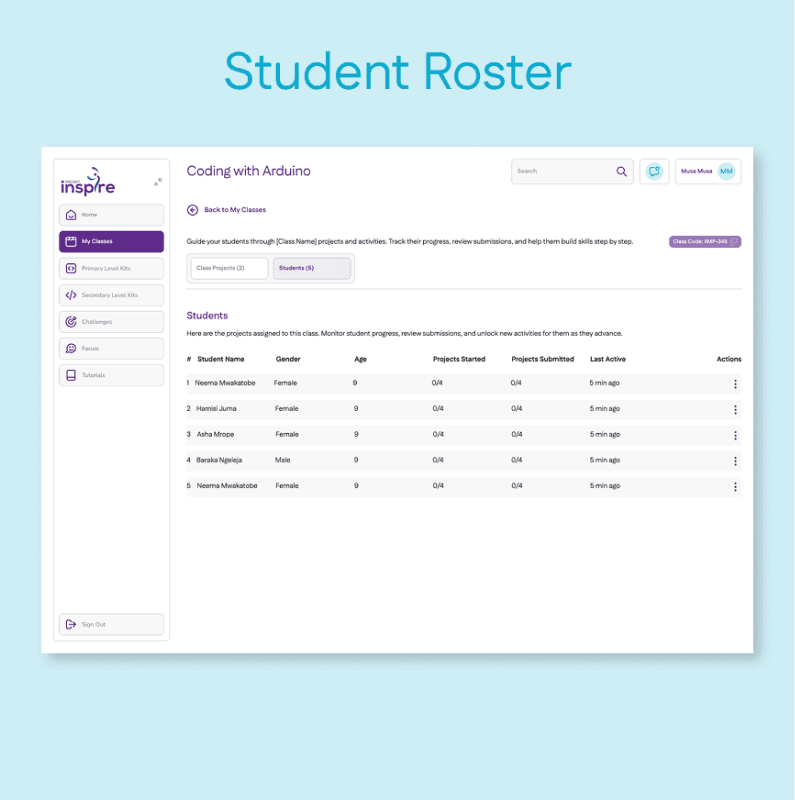
Table view of students showing projects started, submitted, and last active time.
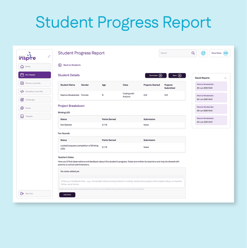
Per-student breakdown of project status, points, and submissions, with a teacher notes field for parent and admin visibility.
Outcome
The platform was designed to support pilot deployment across Tanzanian classrooms, with the client retaining full control of the rollout. Based on what the product was built to do:
The class-code onboarding system was designed to let teachers set up a full class and assign projects in a single session.
The offline-first architecture was built to ensure students would not lose project progress in low-connectivity environments.
The AI hint system was positioned to provide the most value at circuit setup and code steps, the two most technically demanding moments in each project.
What I learned
Designing for children is not about simplifying for adults. A 9-year-old needs faster feedback, higher visual reward, and a shorter path between action and result. That is a different set of priorities, not a stripped-back version of the Secondary experience.
The offline constraint was the most clarifying design pressure on this project. When you cannot assume a connection, decisions about local state, sync behaviour, and failure handling become explicit rather than assumed. That pressure produced better decisions than a connected-first approach would have.

